Design for Educating Users
Redesign the IYI (Invest your interest) experience on the app to educate user about the feature and invest
Overview
This is a savings + investment feature. Instead of leaving all your money in a savings account, it takes only the interest earned on your balance and invests that into ETFs (Exchange Traded Funds).
During this ongoing project, I contributed by redesigning the dashboard page and bottom sheet.
Why this matter?
Business → More people using feature means profit, better retention and long-term engagement.
User → Investing their interest makes their savings grow and gives them more profit.
My Role
Owned the end-to-end design process, leading UX and UI from concept through prototyping.
Timeline
2 weeks
Problem Space
Why we need to solve the problem?
Low conversion from dashboard
Less than 10% of users moved from the dashboard to the next page and invest. Nine out of ten people look at your carefully crafted dashboard and.. leave.
1- Feature misunderstanding
We assumed users did not clearly understand the IYI feature or that it invests interest earned on their savings account.

The pre-redesign experience of IYI page
2- Cognitive overload
Too many options were presented to user on each screen, leaving users confused about what action to take.

Current flow of the IYI experience
The Insight That Changed Everything
I realised users weren't asking 'what is the features?' they were asking
What is this?
When does it happen?
Where am i investing?
How much returns will it provide?
Fundamentals of ETF?
Is this safe?
Constrains
Hierarchy for dashboard page will be:
Youtube
How does it work
Calculator for IYI
When the user is confirming or confirmed, display a bottom sheet with the operational and ETF details.
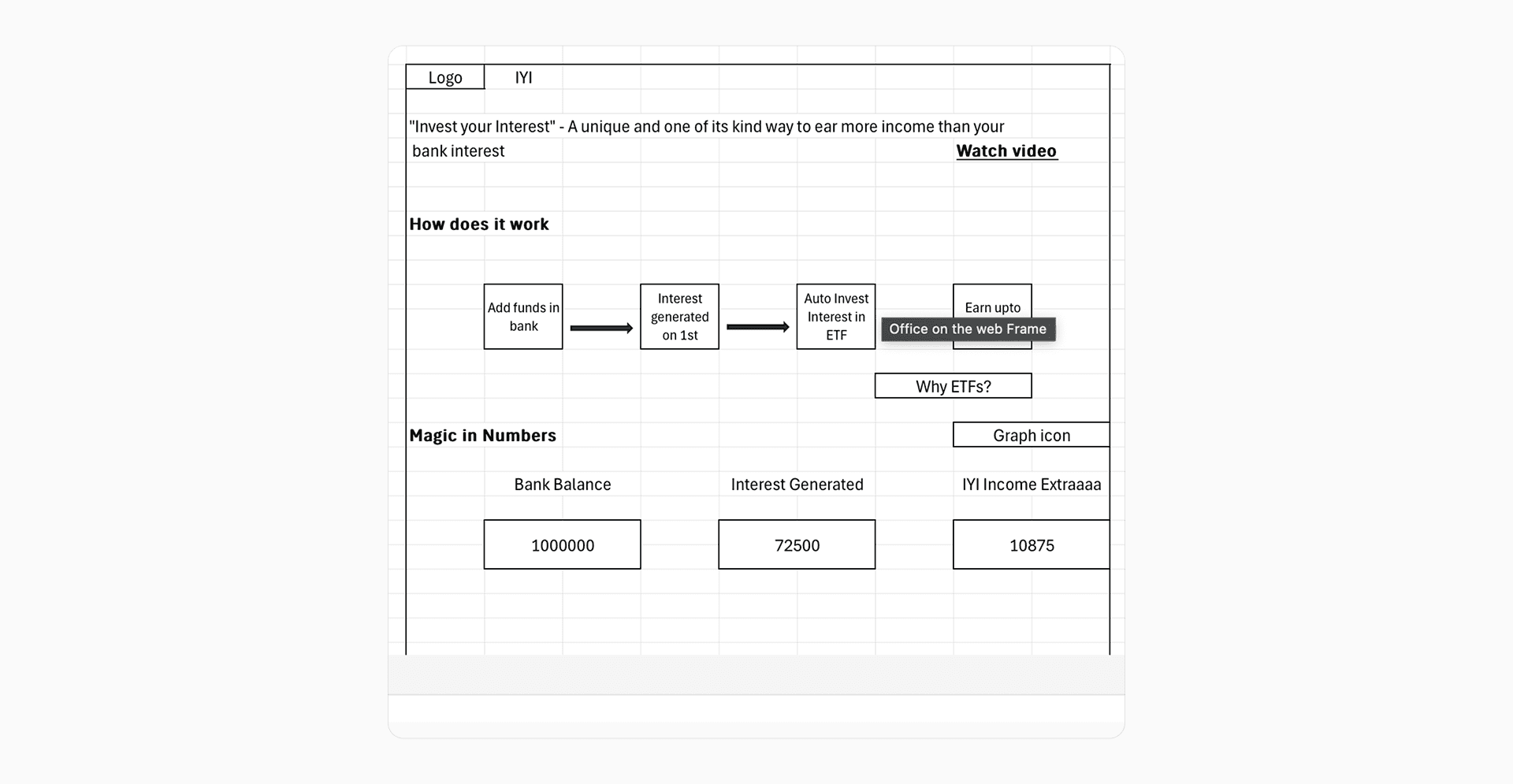
Simplify the IYI experience - provided by CEO
Behind the scene (Iterations)
Youtube Section
The video section on our dashboard had only 10% engagement while taking up too much space. Options 1-3 showed a thumbnail with a play icon, suggesting in-page playback, but actually redirected to YouTube potentially generating more clicks but creating user frustration. Option 4 displayed the YouTube icon, clearly signaling external navigation possibly fewer clicks but aligned expectations.
We chose Option 4 because we decided the video still provides value who need it (e.g., new users learning the feature). Rather than remove it entirely, we made it compact and transparent. This way, we reclaim space while serving users who genuinely want the educational content.
Learning - Transparency preserves user trust even when it means potentially lower engagement numbers, informed clicks are more valuable than misleading ones.

Iterations of educating user about IYI
Educating User
Created multiple card designs that visually explain the feature directly on the dashboard, alternative to watch a video. Early options were compact and east but left excessive white space on dashboard due to smaller card size. Later options better utilized available space and included visual trust markers but requires more time to understand.
We chose the last option because it: (1) fits dashboard proportions appropriately, (2) includes trust markers that motivate hesitant users to invest, and (3) directly answers "How does this work?"

Iterations of educating user about IYI
Operational details
For the bottom sheet, we focused on operational clarity showing exactly what happens on which dates, removing any hidden cost about the process and maintaining transparency.
Selected the second option as this is compact, tactful and answer every necessary question.

Easily conveying user the operational details
Design
First-fold (Educating user)
Video is placed at the top in a compact size, making it easy for users to access if they wish.
Below it, the Invest Your Interest section is divided into two parts: Why to Invest and a carousel that answers key questions, What it is, When it happens, Where it goes, and What to expect.
Once users understand the concept, they can explore the IYI Calculator to estimate potential returns.
Finally, a one-click investment option followed by a clear CTA makes it simple to get started.

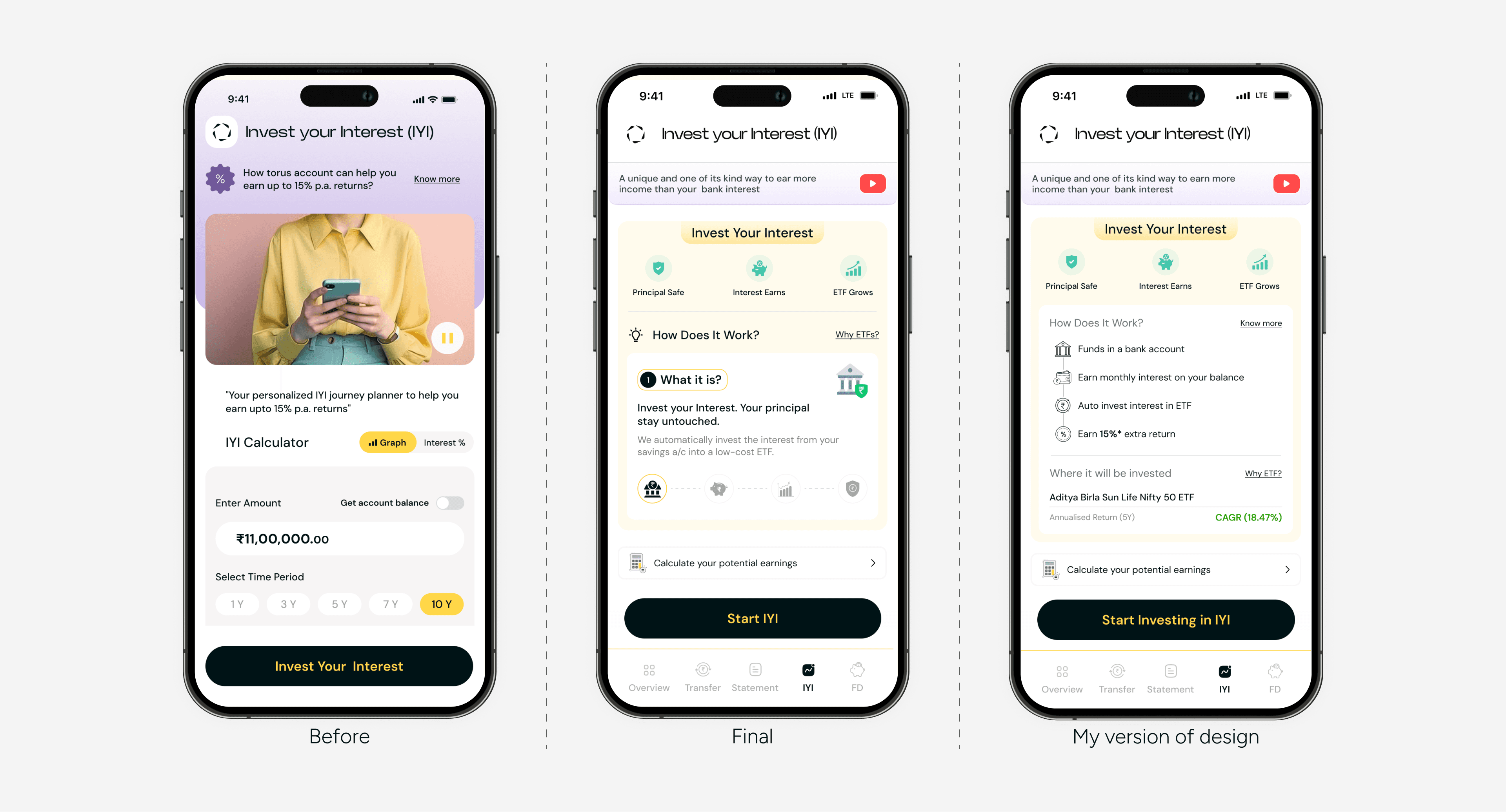
Before and After dashboard page of IYI
Card in action

Educational card
Bottom sheet
ETF Investment Details
5-Year Returns: Show projected return
Here’s What Will Happen
On 1st Sept we’ll use your interest to buy your selected ETF.
By 2 PM, your order will be placed (as long as at least 1 ETF unit can be bought with the interest).
You’ll see the units in your Stocks & IYI Dashboard the same day.
They’ll be credited in your Demat account by 3 Sept.
If your interest isn’t enough, just add money to generate higher interest and we’ll try again next month.

Easily conveying user the operational details. Click on card to start the prototype again.
My variation (If i was the decision maker)
Questions users still have in mind on final design to make better decision:
What is IYI and how it works?
How much returns will it provide?
Where are we investing?
Long term or short term?
Fundamentals of ETF?
Is this safe?
Tested & Intuitive
In a 5-second test, this screen felt much easier to use than the previous one.
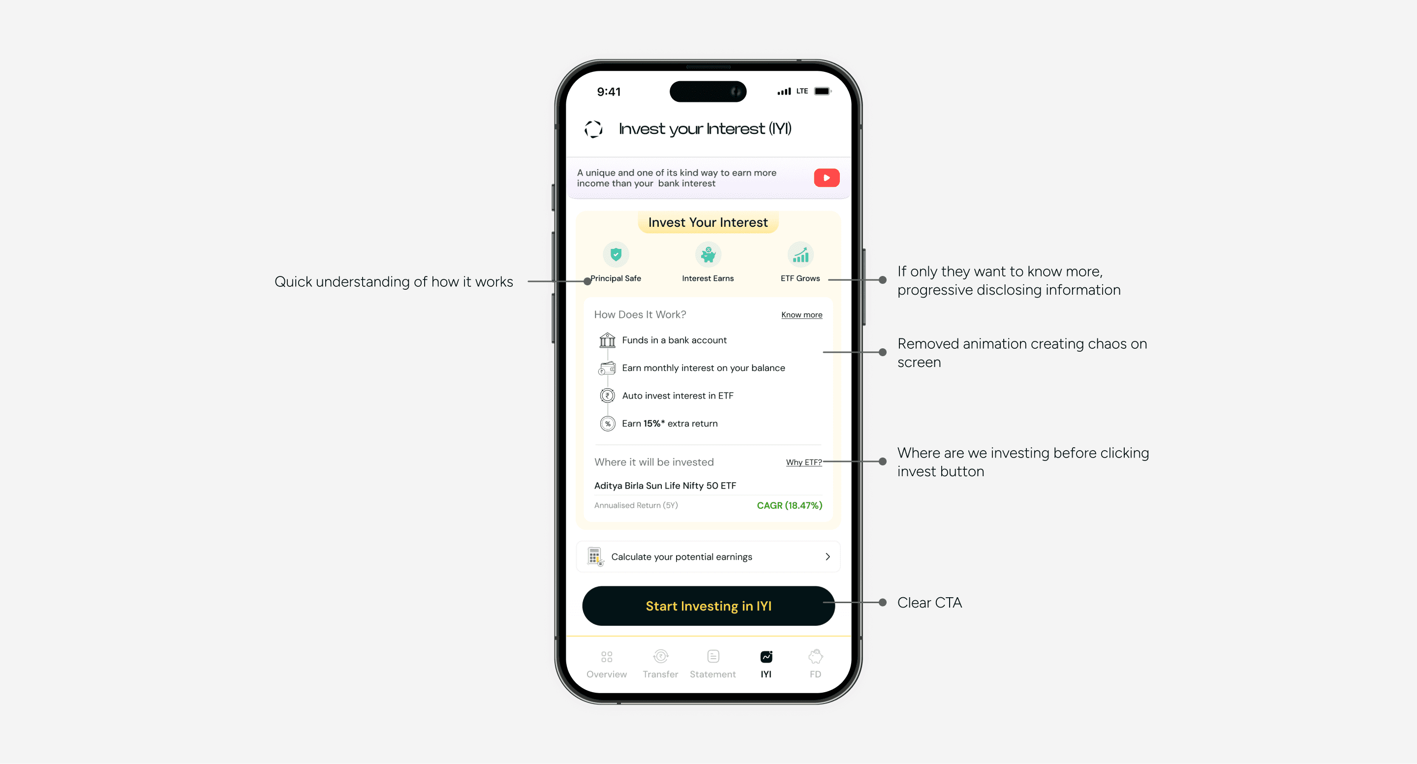
Clear and educate user about feature
Before vs after
Clear and educate user about feature
Wrapping things up
What began as a minor project with small updates evolved into a comprehensive revamp aimed at enhancing consistency, streamlining user actions and flows for Torus Digital users.
Understanding how startups launch features, gather direct user feedback, and then iterate on them intrigued me and made me reflect on whether this is the right approach. I learned that designing on assumptions can be fast but risky—the key is to test, release small and learn from real users, and iterate quickly so assumptions turn into actionable insights rather than mistakes.
Special thanks to Sonal for helping me understand the feature and to Pratik for their steadfast support.